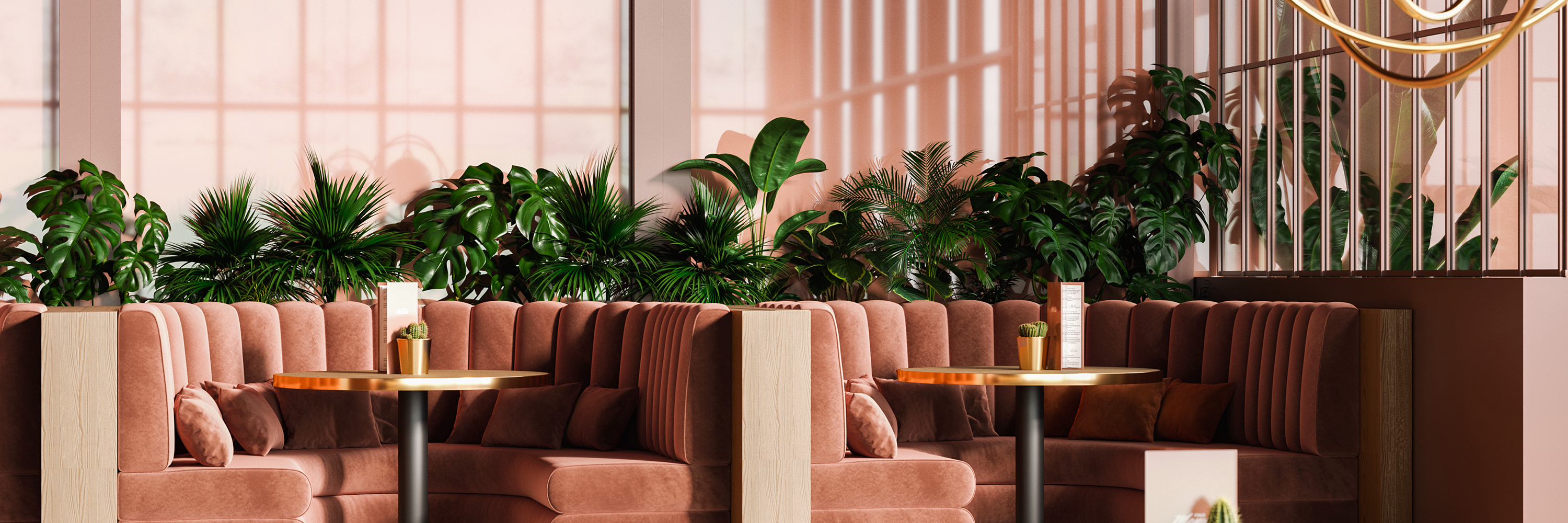
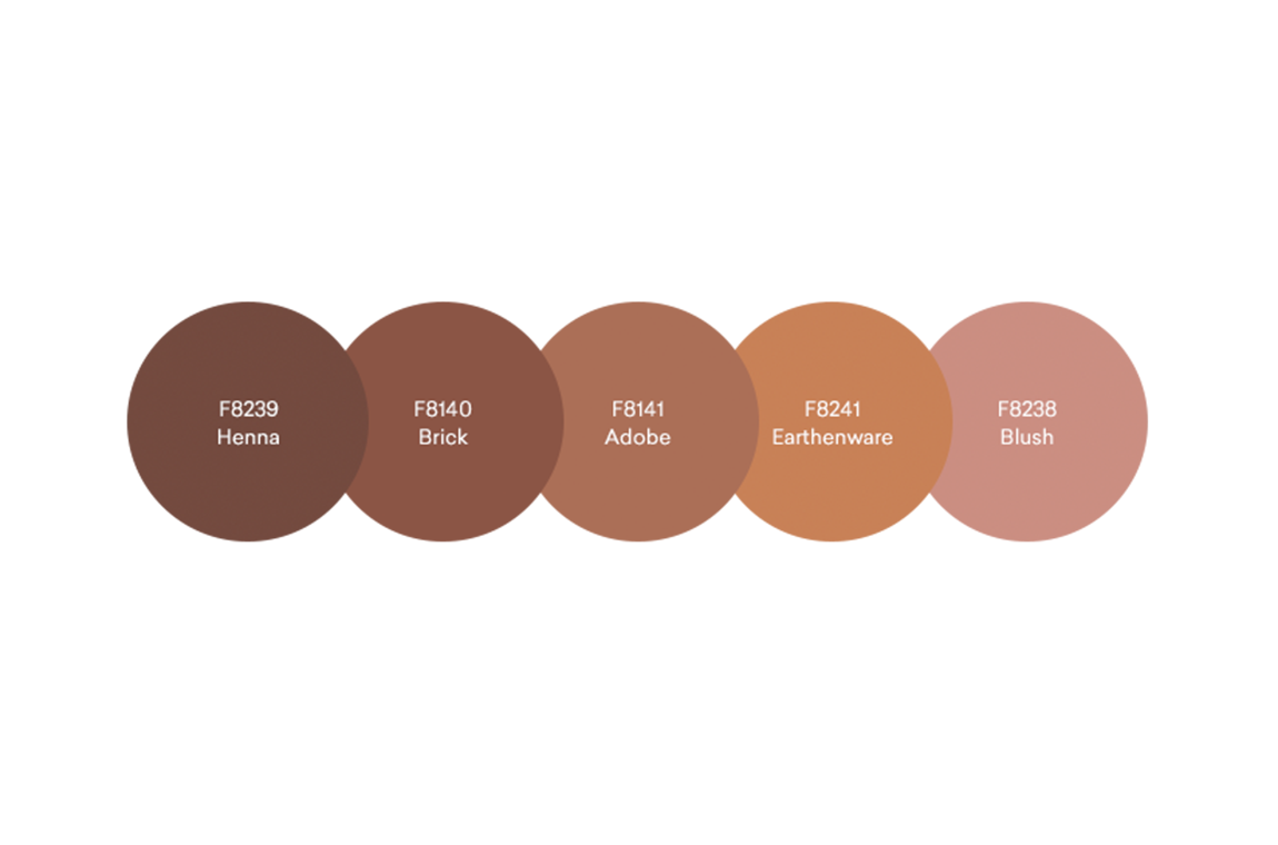
ADOBE is the palest of the three. It combines well with dark brown woodgrains and natural sand tones.
BRICK is a saturated earthy colour, deep but at the same time subtle and soft. Paired with a matt finish, it is ideal for trend led interiors.
HENNA is the darkest of the three, a very elegant red-brown that brings instant sophistication to designed spaces, no matter if in retail, hospitality or residential projects.
BLUSH is a wonderful example of a new generation of neutral colours that are conquering commercial and residential spaces world-wide. It is loved for its individualist character as well as its inoffensiveness and it is a colour of wellness, with calming effects on body and soul.
EARTHENWARE is the typical planter pot colour, with grey tones to bring it up to date with modern trends.
Nina Bailey, Design Manager for Formica Group comments, “The natural colour quality of these tones allows the newly developed palette to offer a comforting and grounding feel. The new reds palette consists of a selection of terracotta tones including Henna, Adobe and Brick. Alongside these, we have developed a Blush pink which we see take the centre stage of the design world with its usable greyed hue, making pink a more gender neutral colour. We also have the Earthenware, our new deep and natural tone, this colour sits as a hybrid between a rich orange and a neutral. These colours are extremely usable and adaptable, allowing colour to be added in a less intrusive way.”
Order your free samples today